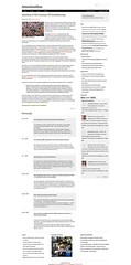
Leaner times are ahead, so I thought I’d shoot for a simple, minimal design for this blog, with an emphasis on white space. Besides, my old blog’s header image was a panoramic shot of lower Manhattan, take from Brooklyn; I moved out of Brooklyn two years ago. Also, my blog was hacked this past year, and I think it had something to do with funky code in my last design template.
Let me know what you think. I adapted it from the Gridline Lite, a WordPress theme by Graph Paper Press (thanks guys). I tweaked a few things here and there, but I’m not a programmer. So let me know if you encounter any bugs.


![Reblog this post [with Zemanta]](http://img.zemanta.com/reblog_c.png?x-id=dcd5eb10-ce8a-4ba5-a58e-fd0eb37c3bc5)
Looks sharp
I really like this theme. I tried using it for my blog but I couldn't get it to work. I'm jealous.
Hi – I was going to comment before, got distracted. It's great. One tweak I'd suggest – reduce the header size so more content shows above the fold. Do you use any sort of analytics? Depending on where people click (including you), you might reorder/eliminate the content in your sidebar and footer.
Thanks Pete. I know I can eliminate a lot of content. Less is definitely
more. Simplicity is the highest art.
Thanks for sharing
Delete.
A refreshing change. Good choice. Glad I tore myself away from Google Reader to view it.
Thanks, Vanessa. Cheers.
Thanks, Vanessa. Cheers.